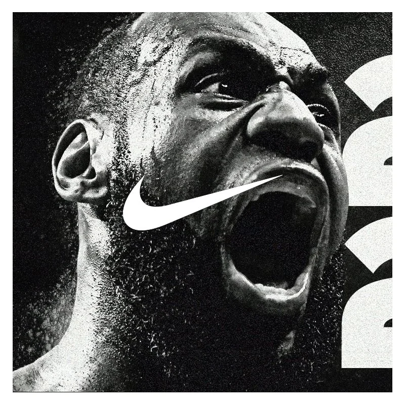
This conceptual project explores a potential Nike 2025 campaign that highlights three dominant athletes: LeBron James, Caitlin Clark, and Carlos Alcaraz. Titled "Rise Above. Rule the Court.", the campaign underscores their unmatched skill, tenacity, and leadership on the court. Each design features bold monochromatic silver tones, symbolizing the number 25 and the silver anniversary. The designs integrate a clean crown motif to represent their supremacy in their respective sports. The choice of silver not only aligns with the "25" theme but also adds a timeless, powerful edge to the visuals, celebrating their rise and dominance in 2025.
NIL campaigns, promotional materials and game-day designs for Florida Victorious of the University of Florida Gators.
Project details:
Client: Florida Victorious · Role: Lead designer
Deliverables: In-stadium graphics, NIL signing announcements, social media, promotional print and athlete cards
The Challenge
When name, image and likeness (NIL) changed college sports, Florida Victorious stepped up to help Gator athletes take advantage of it, and to show fans how they could support the players they cheer for every Saturday. They needed a steady stream of high-energy visuals that felt as big as game day in The Swamp and got fans to join, support and spread the word.
My Role
For 2 years, I was a go-to designer for the Florida Victorious team, building visuals across every touchpoint:
NIL signing announcements: bold graphics introducing current and incoming Gators as they joined the program
In-Stadium Graphics: large-format pieces designed to hit from the stands on game day
Social Media Campaigns: game-day posts, recruitment pushes and “Join Today” calls to action built for Instagram and X
Promotional Materials: event invites, save-the-dates, posters and print pieces
Athlete Posters/Cards: collectible-style cards fans could connect with and share
The Approach
Gator fans are some of the most passionate in college sports, so the design had to match that energy. I leaned into bold orange and blue, big condensed type, and dramatic athlete photography to make every piece feel like a moment. At the same time, I kept a consistent system so Florida Victorious became instantly recognizable, whether it was on a stadium screen, a phone feed or a printed card.
The goal was always the same: celebrate the athletes, and make it easy for fans to get involved.
The Result
Over 2 seasons, I helped give Florida Victorious a consistent, high-impact visual voice that connected fans, athletes and the program, and turned support for the Gators into real action.
I joined the effort as Florida Victorious launched in 2023 as the lead NIL entity of Gator Nation, and had the chance to design through a remarkable run: a 2024 football class featuring five-stars DJ Lagway and LJ McCray that climbed into 247Sports’ top 10, and a men’s basketball team that won the 2025 national championship. Being part of the team telling those stories, one signing graphic at a time, was a career highlight.
Go Gators. 🐊
2023 Launch year · Top 10 2024 football class (247Sports) · 2025 Basketball National Champions
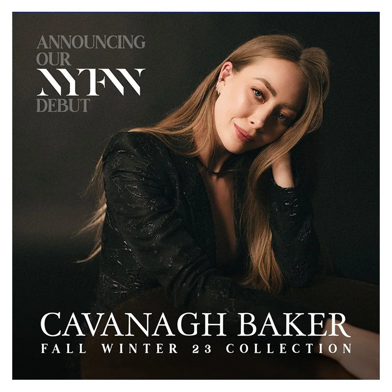
In celebration of Cavanagh Baker's highly anticipated debut at New York Fashion Week, we embarked on an exciting project to design a series of elegant invite cards and captivating social media posts. Our goal was to create visually stunning materials that would not only reflect the sophistication and luxury of the brand but also generate buzz and excitement for this milestone event.
Invite Cards: We crafted a collection of invite cards that embodied the essence of Cavanagh Baker's style—timeless, chic, and effortlessly glamorous. Each card featured a blend of exquisite typography, high-quality finishes, and a sophisticated color palette, ensuring that every recipient felt the exclusivity and significance of the invitation. The designs incorporated subtle yet impactful elements, such as embossed textures and metallic foiling, to elevate the tactile experience and make a lasting impression.
Social Media Design Posts: To complement the physical invitations and maximize digital engagement, we developed a series of social media design posts. These posts were strategically planned to build anticipation and highlight key moments leading up to the show. Featuring a cohesive visual theme, the designs included sneak peeks of the collection, behind-the-scenes glimpses, and stylish countdown graphics. Each post was tailored to resonate with Cavanagh Baker's audience, showcasing the brand's unique aesthetic while encouraging interaction and excitement.
Overall, this project was a blend of creativity and strategic design, aimed at amplifying Cavanagh Baker's presence at New York Fashion Week and creating a memorable experience for guests and followers alike.
A Nashville concept campaign for Spotify by designer Alfredo Rodriguez. A billboard, bus, social and advertising banner to get Music City following one playlist.
Project Details
Client: Spotify (personal concept)
Role: Creative direction, campaign design, UI design
Deliverables: Key visual, billboard, bus side, Instagram carousel and playlist cover system
The Idea
Nashville doesn’t just play music. It makes it. Some of the biggest songs in the world were written in a Music Row office, recorded down the street, and first played live on a Broadway stage. But most people streaming those songs have no idea where they came from.
I wanted to flip that. What if Spotify gave Nashville its own playlist, a living mix of the songs this city is writing, recording and playing on repeat right now, plus the classics that built it?
Made in Music City became that playlist, and this campaign is how I’d get people to press play.
The Approach
The goal was simple: get people to follow the playlist. Every piece of the campaign points to that one action.
To make it feel local and fun instead of like another ad, I leaned into what makes Nashville, Nashville: neon signs, honky-tonk energy, and a little hometown pride. The copy talks like a local, with lines like “This town wrote your favorite song” and “Next stop: the sound of Nashville.” It’s proud, a little cheeky, and never cheesy.
Visually, I paired Spotify’s signature green and black with the glow of Lower Broadway. The playlist cover became the hero of the system and updates weekly with a featured local artist, so there’s always a reason to come back.
From the Street to the Stream
The campaign follows one simple path:
1. See it: a billboard on Broadway or a WeGo bus rolling through downtown
2. Scan it: every piece carries a Spotify Code that takes you straight to the playlist
3. Follow it: one tap and you’re in
4. Come back: the playlist refreshes every Friday with new music and a new featured artist
5. Share it: an in-app “You’re listening like a local” badge and story card turn listeners into promoters
On social, an Instagram carousel breaks down “Nashville by the numbers,” with fun stats on what the city is streaming, ending with one clear call to action: Follow the playlist.
Why it Works
Great campaigns give people a reason to care, not just something to look at. Made in Music City taps into local pride and the curiosity of the millions of visitors who walk Broadway every year, then gives them an easy way to take the city’s sound home with them. It’s a love letter to Nashville that also grows Spotify’s listeners.
For Cabin Creek Farms, an inviting Airbnb retreat nestled on 5.5 acres in the charming town of Franklin, TN, we designed a distinctive logo that reflects the property's rustic elegance and natural beauty. The logo features a stylized emblem combining antlers with a creek-like flow, symbolizing the blend of wilderness and tranquility that guests experience at the farm.
Set against a serene background of outdoor seating amidst a lush forest, the logo’s antler motif adds a touch of rustic charm, resonating with the woodland setting of Cabin Creek Farms. The circular text, "Cabin Creek Farms," along with the establishment year, emphasizes tradition and the welcoming nature of the property. The overall design exudes a sense of warmth and sophistication, inviting guests to enjoy the peaceful and scenic environment.
This logo captures the essence of Cabin Creek Farms, making it a perfect emblem for signage, merchandise, and digital platforms, and ensuring that it communicates a memorable and cohesive brand identity to all visitors and potential guests.
I'm a designer, not a traditional developer. So I built MyPocketChefAI by vibe coding: describing what I wanted in plain language and working alongside Claude, an AI assistant, to turn it into working code.
It felt less like programming and more like art directing. I'd describe a screen or a feature, Claude would build it, and I'd react: “tighten the spacing, this flow needs one less tap, make the recipe card feel more like a cookbook. “
We'd go back and forth until it felt right.
The Process
Idea & flows: Mapped the core journey: add ingredients, get recipe ideas, cook step by step, save favorites.
Brand & UI: Designed the name, logo, color palette and screens in Figma, so the app had a clear look before any code was written.
Build: Worked screen by screen with Claude to turn the designs into a working app, including [the AI recipe generation, user accounts, saved recipes].
Test & Refine: Used it in my own kitchen, found what felt clunky and fixed it, again and again.
Launch: End of 2026
The logo design for The Caring Link encapsulates the organization's mission and values. The heart symbol represents care and compassion, central to The Caring Link's ethos. Within the heart, a puzzle piece link is integrated, symbolizing connection and the organization's role in piecing together a supportive community for students. The clean and modern typography paired with a vibrant blue background conveys a sense of trust, stability, and hope. This logo not only visually communicates the organization's purpose but also serves as a beacon of support for the students and communities they serve.
The logo for Electric Picture Farm (EPF) is a distinctive and bold design that encapsulates the essence of a full-service creative agency specializing in photography, live broadcast, video, film, and branded content. The logo features a hexagonal shape, symbolizing strength and versatility, with the stylized initials "EPF" prominently displayed within. The typography is modern and clean, with a subtle distressed effect that adds a touch of texture and character, suggesting a blend of creativity and authenticity.
The name "Electric Picture Farm" and the tagline "Hard-Picked Talent" underscore the agency's commitment to curating top-tier creative professionals and delivering high-quality, tailored services. The use of the lightning bolt in the word "Electric" emphasizes energy, innovation, and a dynamic approach, while the overall design exudes professionalism and a strong visual identity, making it easily recognizable and memorable. This logo effectively represents Electric Picture Farm's unique position in the creative industry, combining artistic excellence with a modern edge.
Fleet graphics, print and web design for a Franklin, TN septic company built on “Stress-Free Septic™.”
Project Details
Client: Outright Septic
Location: Franklin, TN
Role: Designer
Deliverables: Truck and van wraps, postcards, stationery, website design and elements
The Challenge
Septic service isn’t something most people want to think about, until they need it. Outright Septic set out to change that experience with a simple promise: Stress-Free Septic™. Friendly technicians, easy booking and reliable service across Middle Tennessee.
They needed a brand presence that matched that promise everywhere customers see them: on the road, in the mailbox and online. It had to feel clean, confident and approachable, not like a typical septic company.
My Role
I designed Outright’s visual presence across their most important customer touchpoints:
Truck and Van Graphics: Fleet wraps designed to be readable at a glance on the highway and memorable in a driveway, turning every service call into a rolling billboard
Postcards: Direct-mail pieces built to grab attention and drive bookings across their 11-county service area
Stationery: Business cards, letterhead and branded materials that give every customer interaction a polished, professional feel
Website Design and Elements: Graphics and design elements for their site, carrying the same look online so the brand feels consistent from the truck to the booking page
The Approach
The goal was to make a dirty job look clean. I leaned into a fresh, crisp look with bold, simple layouts and clear messaging, so the brand feels trustworthy and modern. On the trucks, that meant big, legible branding and a phone number you can catch at 45 mph. On print and web, it meant keeping everything consistent so customers instantly recognize Outright wherever they see it.
The Result
Outright now has a cohesive brand that rolls through Williamson County and beyond, from Franklin and Brentwood to Leipers Fork. The fleet, mailers, stationery and website all tell the same story: Septic service doesn’t have to be stressful.
For Iris + Pinhole, a photography rental studio and private venue located in the artistic neighborhood of Berry Hill, Tennessee, I created a distinctive logo that encapsulates the brand's creative essence and professional focus. The logo features a stylized representation of a camera's shutter lens, symbolizing the precision and artistry inherent in photography.
The design prominently displays the brand name "Iris + Pinhole," paired with a bold and modern typeface, exuding a sense of clarity and sophistication. The use of a minimalistic color palette with gold accents highlights the premium quality and exclusivity of the services offered. The addition of "Established Twenty Fifteen" grounds the brand in its history, showcasing its established presence in the photography community.
This logo not only reflects the technical aspect of photography but also resonates with the creative spirit of Berry Hill, making it a perfect emblem for a space that serves as both a professional studio and an inspiring venue. Whether used on signage, marketing materials, or digital platforms, the Iris + Pinhole logo serves as a recognizable and cohesive visual identity for the brand.
These branding projects showcase the ability to cater to a wide range of industries and client needs, delivering unique and impactful logos that strengthen brand identity and market presence. Each design was thoughtfully created to align with the specific objectives and target audiences of our clients, resulting in a successful and engaging brand representation.
During my freelance tenure at Van Bram Marketing, I led the creation of innovative UX web designs, utilizing Adobe XD and Figma to deliver exceptional digital experiences for a diverse range of clients in the technology, healthcare, and real estate sectors. My approach was centered on user-centric design principles, ensuring that each website not only met the aesthetic expectations but also provided intuitive and seamless navigation for end users.
By leveraging the collaborative capabilities of Adobe XD and Figma, I was able to iterate quickly, incorporate client feedback effectively, and deliver final products that exceeded expectations. My work at Van Bram Marketing not only demonstrated my technical proficiency and creative vision but also reinforced my commitment to crafting digital experiences that are both beautiful and highly functional.
This project involved the conceptualization and design of trade show booths for Xarisma and Octanorm, companies specializing in print media displays. The booths were designed to showcase their cutting-edge products and services at print media display events. The design process included creating visually appealing and functional spaces that effectively highlighted the companies' capabilities in producing high-quality print media solutions. Utilizing modern aesthetics and strategic layout planning, the booths were crafted to attract and engage event attendees, enhancing brand visibility and fostering valuable business connections. This project reflects a commitment to delivering impactful design solutions tailored to the unique needs of the print media industry.